

To understand why PROMPT struggled to scale beyond its original audience, I combined heuristic evaluation, contextual inquiry, stakeholder interviews, workflow mapping, and iterative prototype testing. Together, these activities revealed not isolated usability issues, but systemic problems in how care managers searched, prioritized, and acted on patient information.
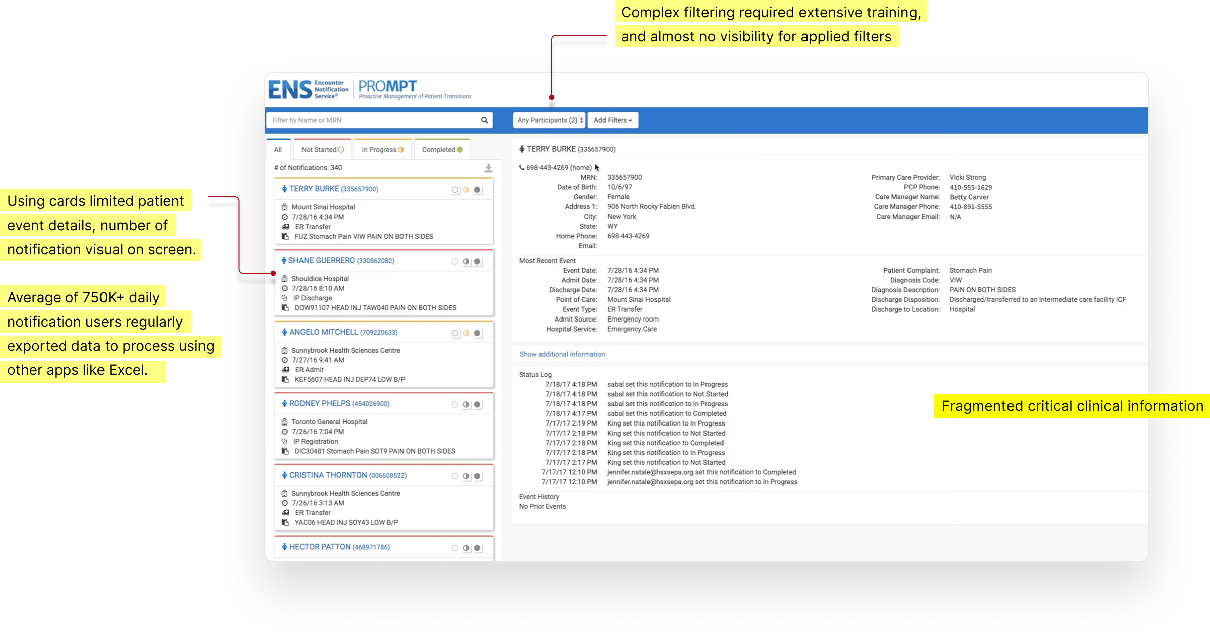
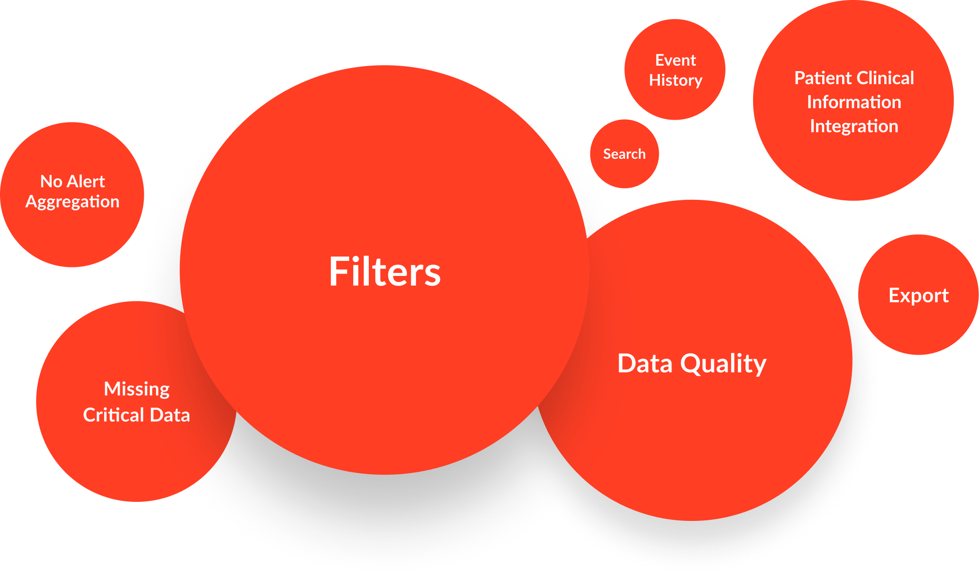

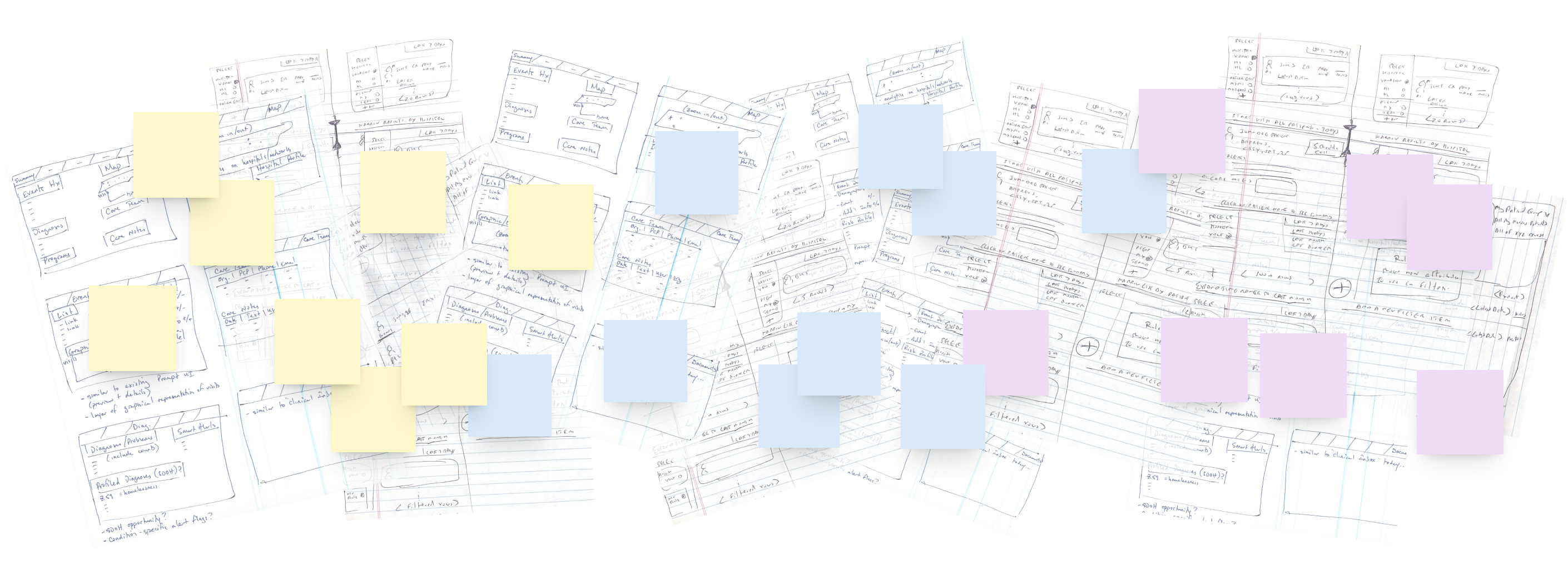
To accelerate discovery while reducing blind spots, I structured the research process around both customer research and cross-functional ideation workshops. Users grounded the team in real workflows, goals, and pain points, while product managers, engineers, clinical SMEs, and account managers contributed deep knowledge of healthcare operations, product capabilities, and technical constraints. Together, these complementary perspectives shaped an interaction model grounded in both user needs and operational reality.
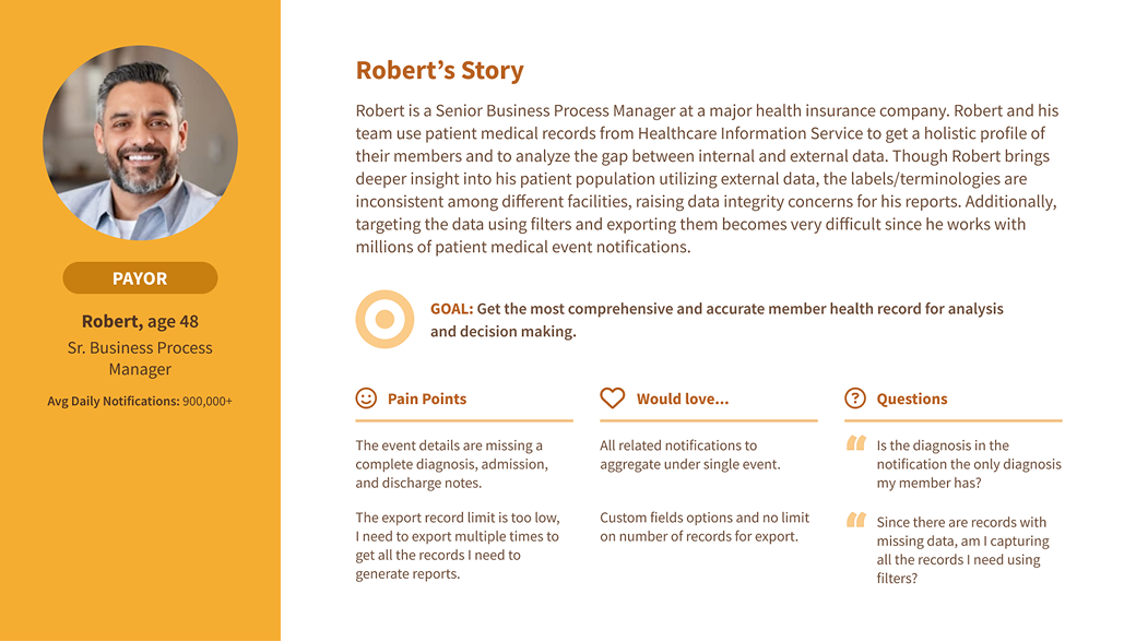
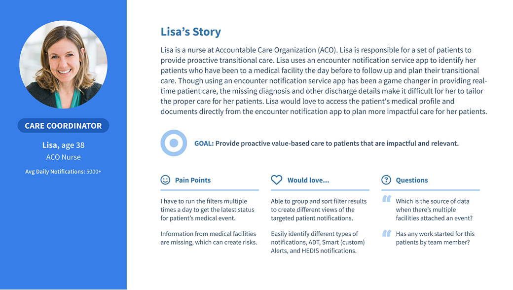
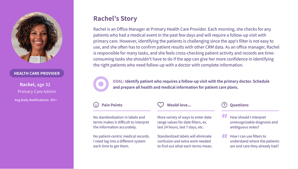
Research findings were synthesized into three primary personas that guided design decisions throughout the redesign.
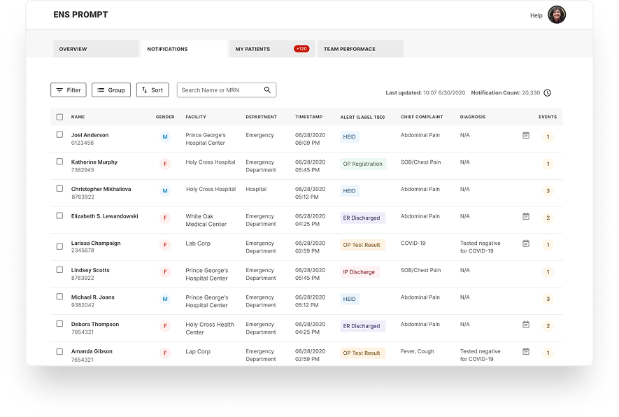
The challenge wasn't accessing patient data—it was helping care managers quickly identify who needed attention next while providing enough context to act with confidence.
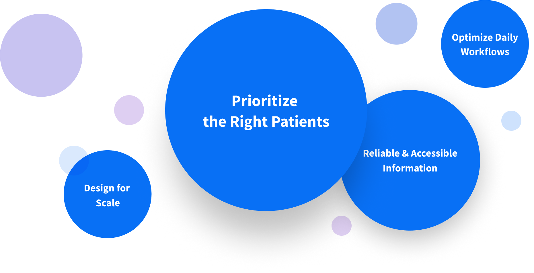
Research revealed that improving PROMPT wasn't simply about redesigning screens—it required rethinking how users identified, prioritized, and acted on patient information at scale. These four UX principles became the foundation for every major product decision throughout the redesign.
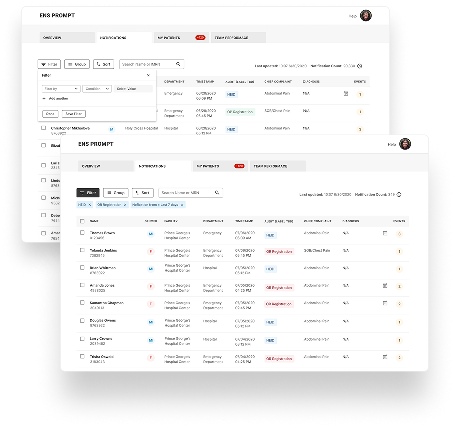
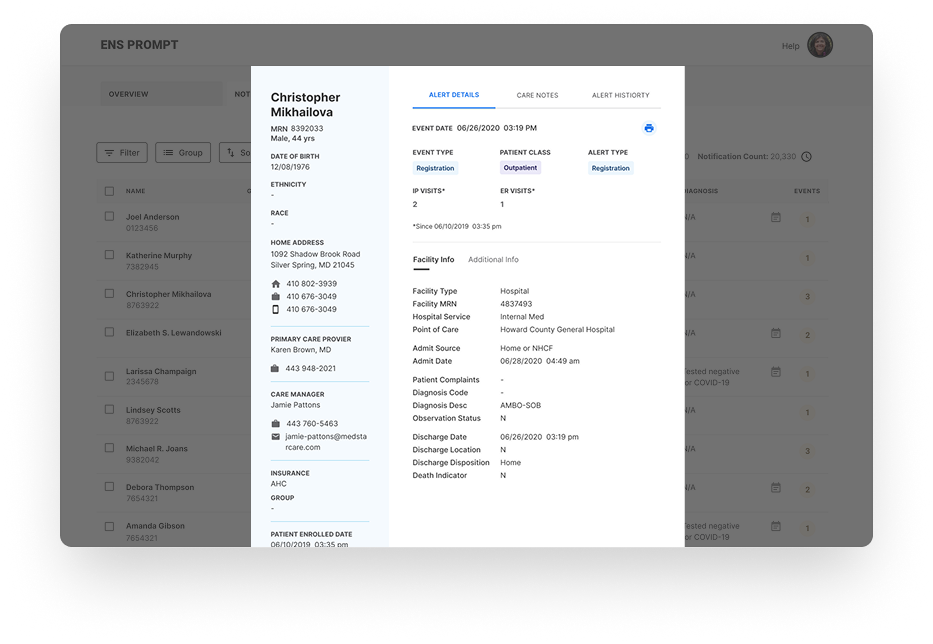
Some of the most important design decisions addressed data integrity and scalability challenges that directly affected filter accuracy and system performance. Working closely with engineering and technical managers, we developed product and operational solutions that improved both platform reliability and user efficiency.
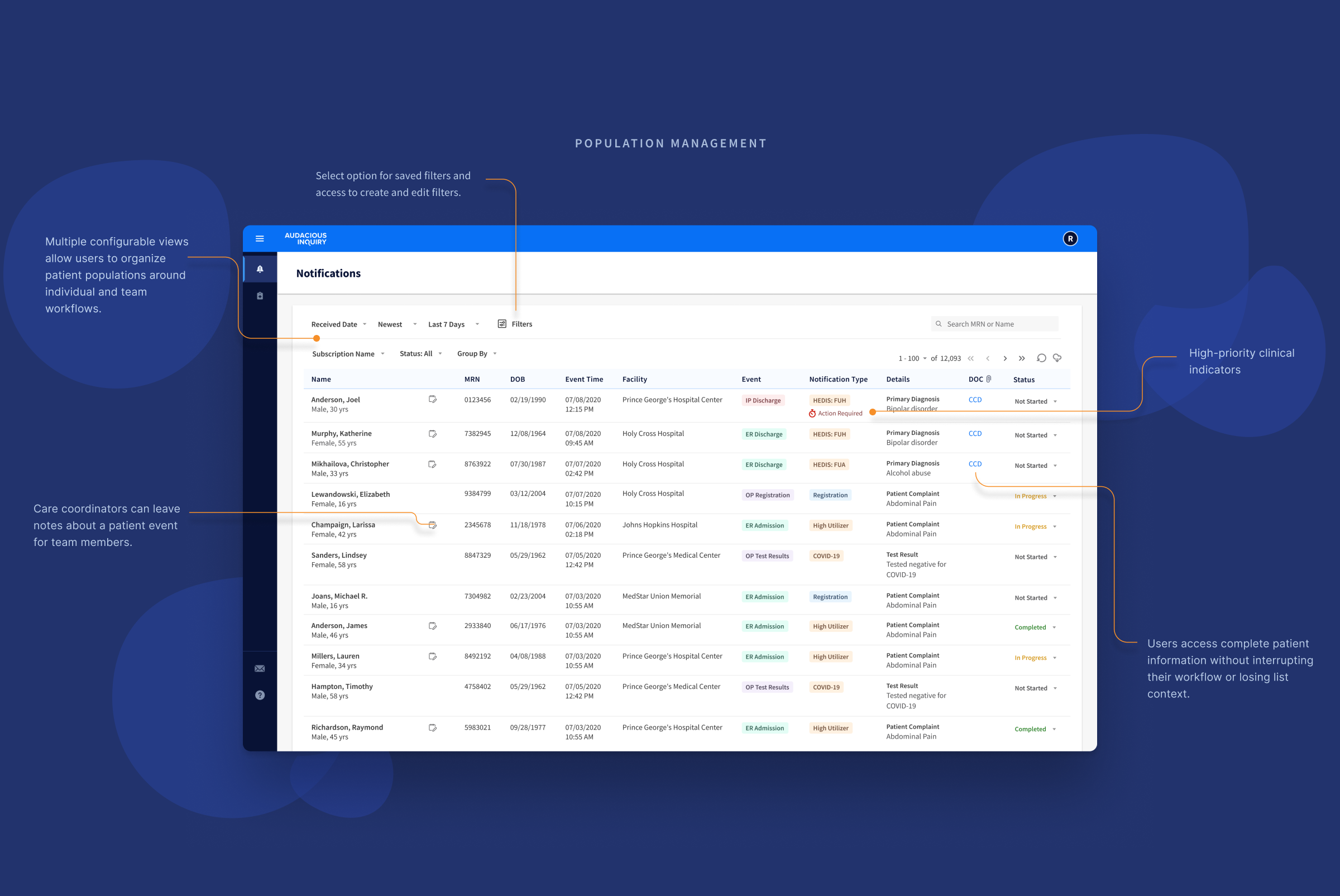
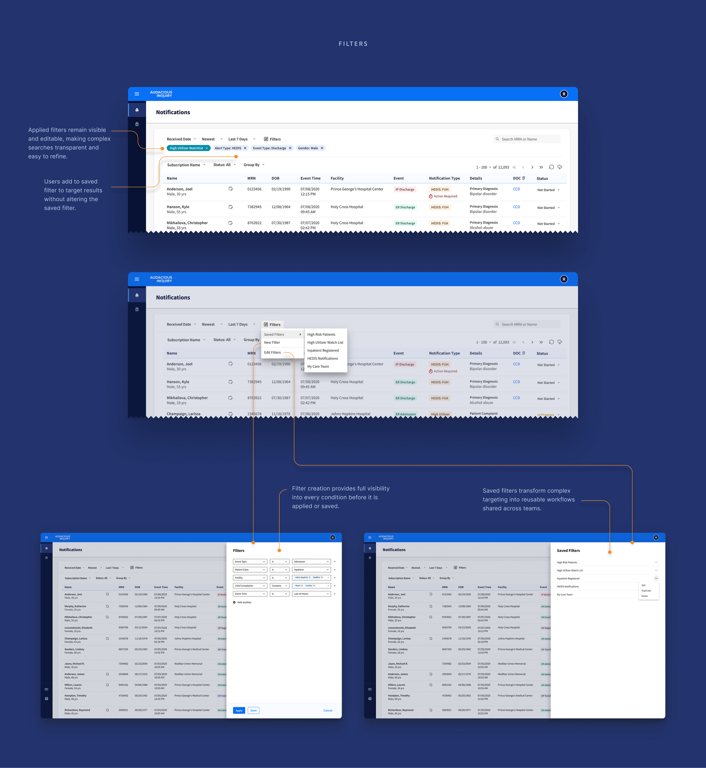
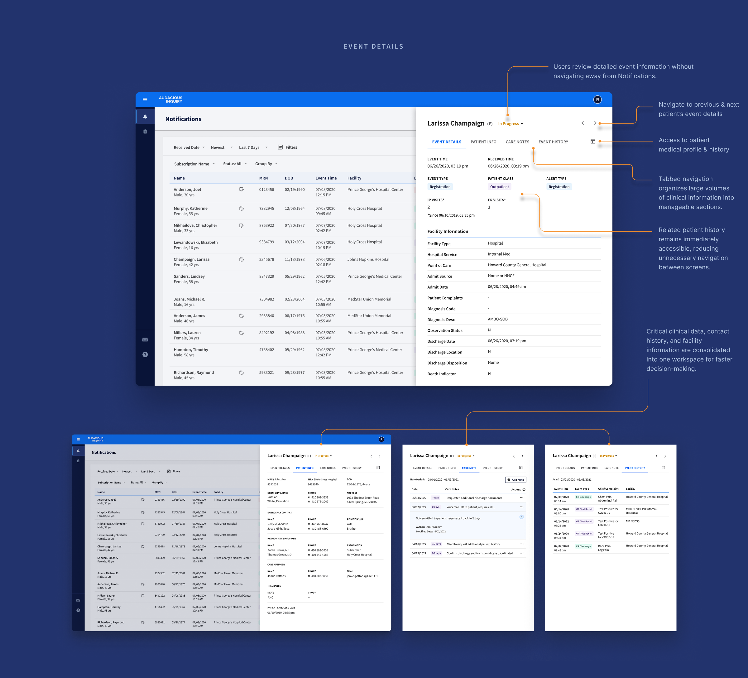
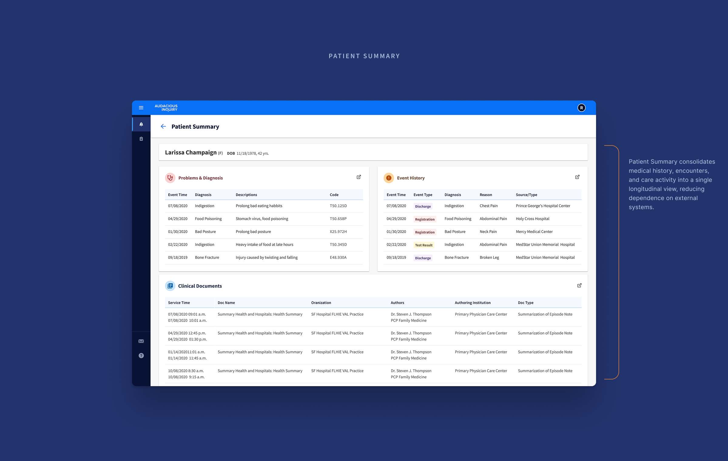
The redesign transformed PROMPT from a notification feed into a scalable decision-support platform. By improving patient prioritization, clinical context, and operational workflows, the new experience strengthened customer satisfaction, increased product marketability, and established a foundation for continued product growth.
One challenge involved the default date range for patient notifications. As organizations scaled toward managing millions of patient event notifications, broader real-time queries began affecting system performance. The initial proposal was straightforward: reduce the available date range. Before accepting that trade-off, we stepped back and reframed the discussion around how users actually managed their daily work.Working together, engineering explored additional approaches while product and design brought user workflows back into the conversation. The result wasn't simply a compromise—it was a better solution. Configurable default date ranges paired with dedicated patient groups reduced unnecessary system load while allowing users to skip repetitive setup and move directly into their daily workflows. The constraint wasn't the obstacle—it became the catalyst for a better solution.
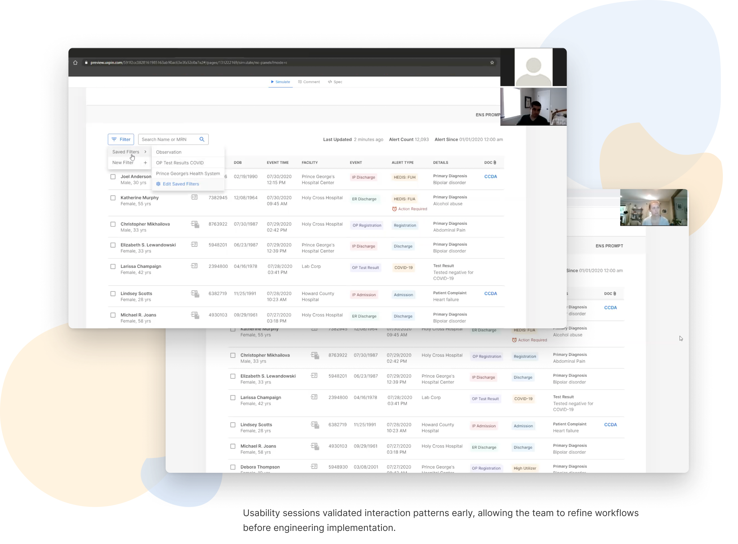
When timelines become compressed, usability testing is often the first activity considered for reduction. The reasoning is understandable: the research is complete, the concepts are grounded in user needs, and cross-functional teams have already helped shape the solution. Yet the interactive prototype quickly proved there was still more to learn.Several interaction patterns changed after testing, including filter management, Event Details, and navigation behaviors. Users who had previously approved the concepts surfaced new insights once they began completing real tasks, often saying, "Now that I'm actually using it..." Those conversations refined the interaction model before development began, avoiding expensive implementation changes while producing a workflow that better matched how people actually worked.