
Redesigned the Workplace Retirement homepage for T. Rowe Price to help participants understand projected retirement income and assess whether they were on track to meet their retirement goals.
Participants closely tracked their balances and savings rates, but often did not know whether those numbers were enough to support them through retirement. With 92% of participants holding less than $28,000 in savings, the need to make retirement readiness more understandable was significant.
Reframed static account data into a decision-support experience that translated savings into projected monthly income, visualized the gap between expected income and retirement needs, and used A/B testing to identify the most effective way to drive understanding and action.
Expanded retirement planning access to all 1.9M plan participants, helping more users assess retirement readiness and prompting action to improve future income.
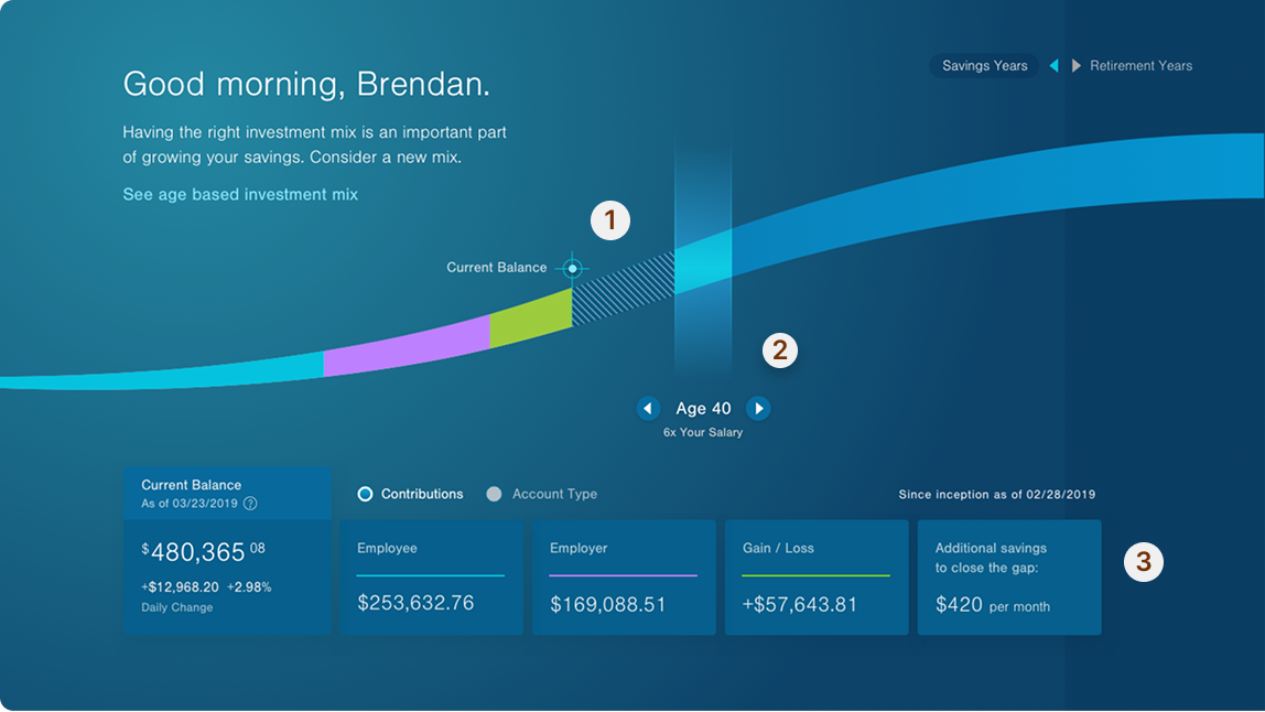
Reframe the homepage from a balance view into a future-focused planning tool. Using T. Rowe Price's Morningstar projection engine and retirement savings gap visualization, the new experience tells users' retirement readiness story — and empowers them to alter its trajectory through actions and nudges.
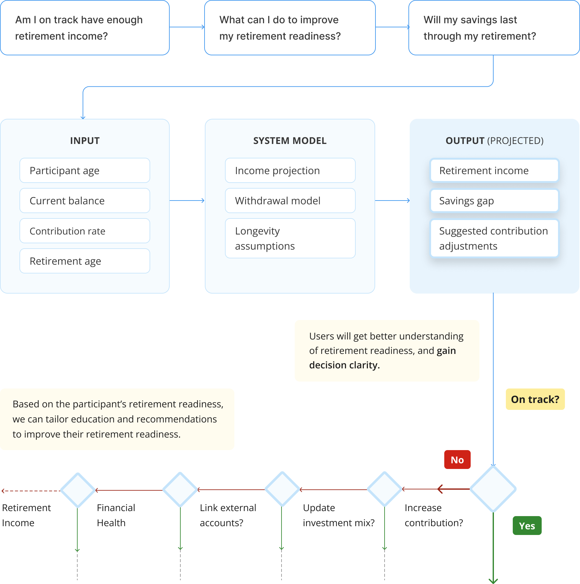
The design challenge was to help users quickly understand the relationship between age, current balance, and contribution rate — and whether they were on track to produce sufficient retirement income — while understanding the consequences of their current strategy and surfacing actions to improve it.
If investors can immediately see how their current savings trajectory compares to a recommended benchmark, they will recognize gaps sooner and be more motivated to adjust their contribution strategy.
When shown a visual comparison between their current savings trajectory and a recommended benchmark, users immediately recognized the gap and expressed stronger motivation to increase contributions and explore ways to close it.
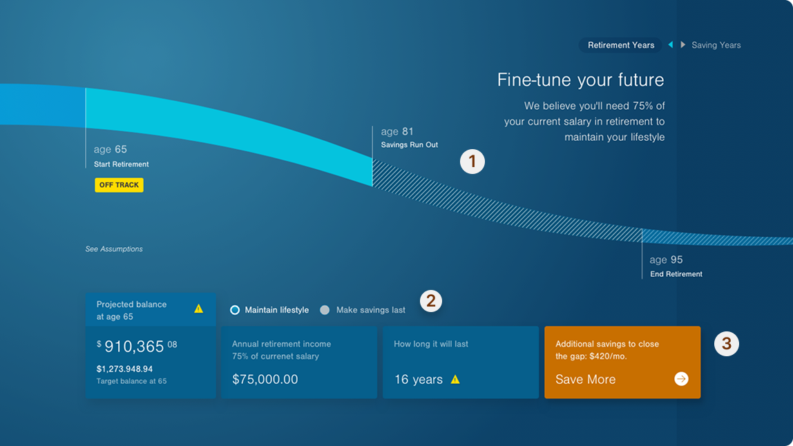
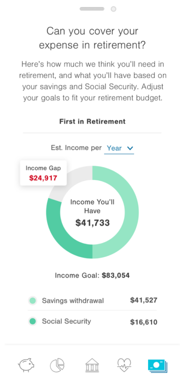
But research revealed something deeper: most users didn't just lack visibility into their gap — they had no frame of reference for what it meant for their future. Seeing a shortfall in dollars wasn't enough. What moved them was understanding the consequence — that without change, their savings would run out. This shifted the design direction from "here is your gap" to "here is your future" — expanding the visualization to trace both accumulation and decumulation, so users could see not just the gap, but exactly when and how their money would run out.
Many visual approaches effectively communicate the savings gap, but fall short of telling a full retirement readiness story — leaving users without a clear picture of when savings may run out or how their trajectory might change. Building on what research revealed, the design traces the full arc of users' saving years, retirement years, and the growth, accumulation, and decumulation of their savings.
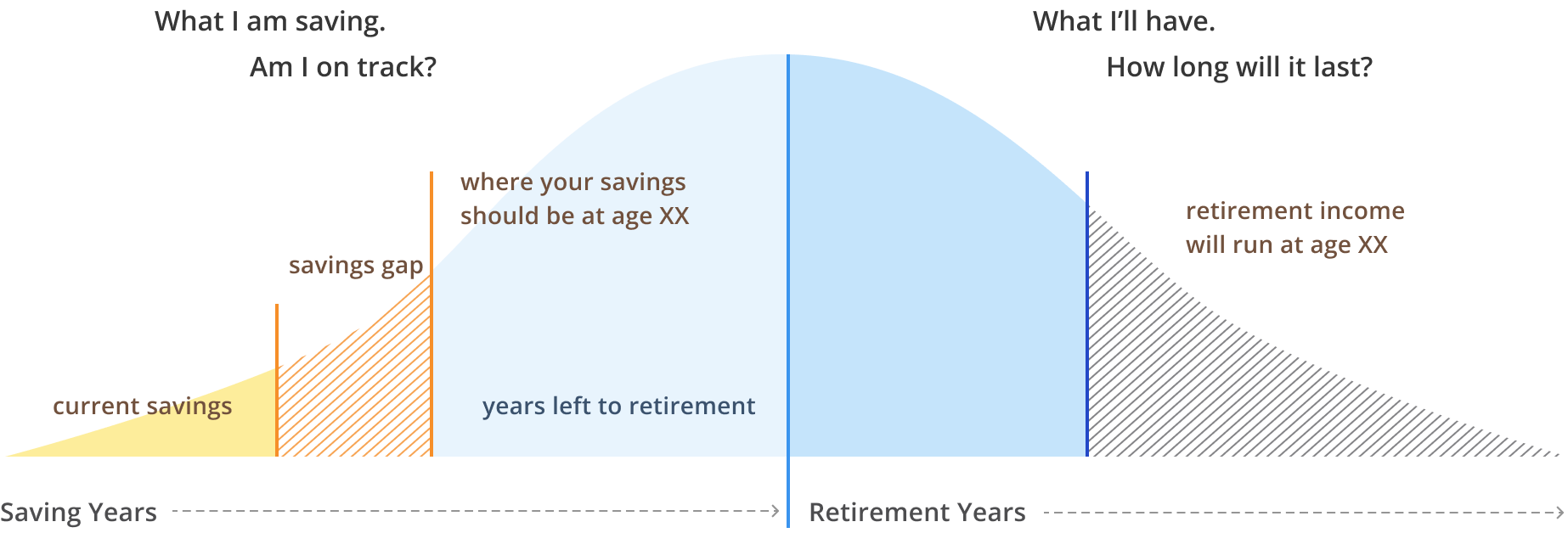
Use a participant balance to their full retirement story from savings years to retirement years.


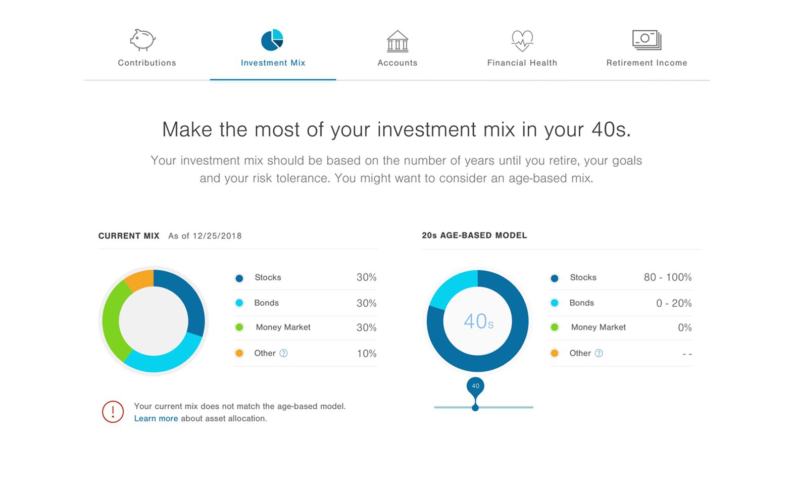
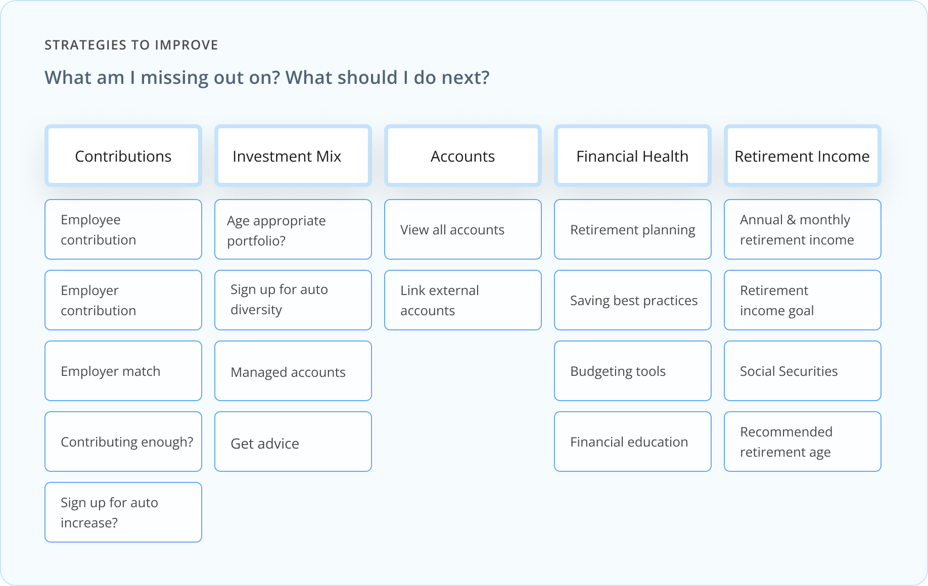
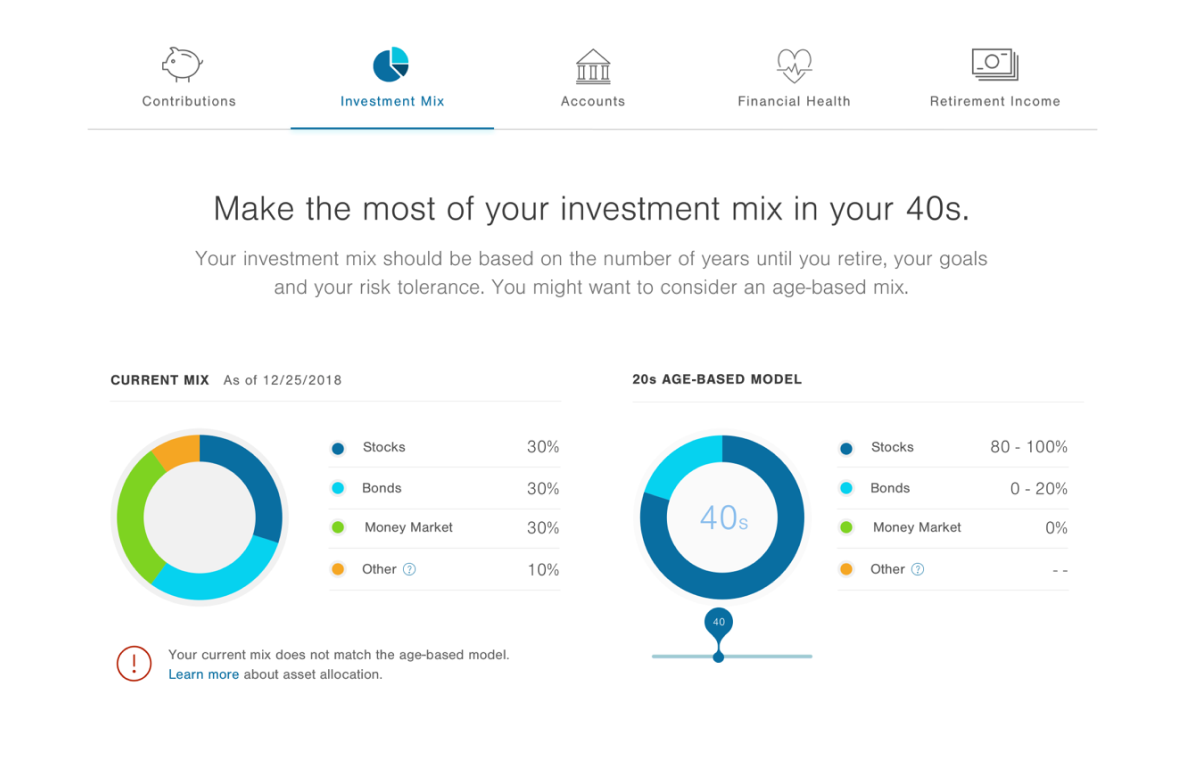
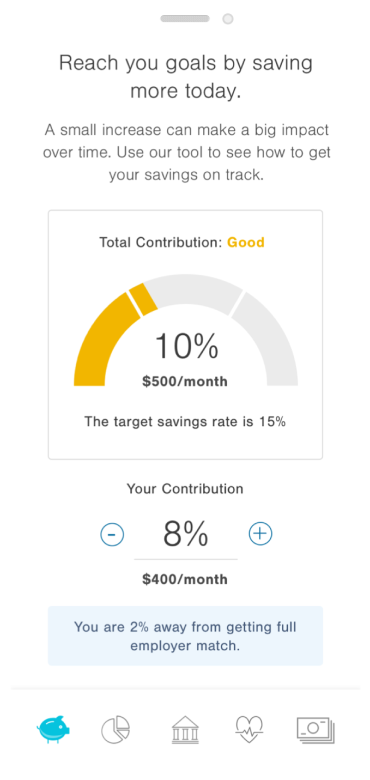
Not all participants can immediately increase contributions, so the experience offers multiple ways to improve retirement readiness across five categories: contribution, investment mix, accounts, financial health, and retirement income. Each area of improvement provides status of their savings and interactive features for them to interact and engage with the contents. Each category provides personalized insights and interactive tools to help participants understand and improve future outcomes.
The homepage is T. Rowe Price's most powerful touchpoint — and the data made that undeniable. With 84% of participants never navigating beyond it, 94% identifying as financial beginners, 92% holding less than $28,000 in savings, and 32% missing their full employer match, bringing the retirement income model directly to the homepage wasn't just a design decision. It was the highest-leverage intervention available.
The results confirmed it. Within two weeks of moving the retirement income experience to the homepage, engagement climbed over 20% — reaching all 1.9 million participants the moment they logged in, including the 84% who would never have found these tools on their own. The redesign earned the Retirement Plan Monitor Awards Gold Medal for Homepage and Account Data.
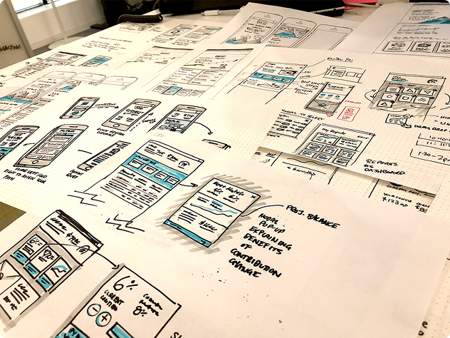
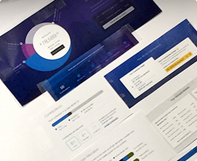
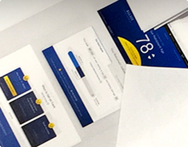
Retirement readiness is one of the most data-rich — and emotionally loaded — challenges in financial UX. The final homepage carries an extraordinary number of data points, and one of the greatest design challenges was presenting them in a way that felt cohesive, elegant, and effortless to the user. A picture speaks a thousand words, and in this case, that picture had to tell a deeply personal financial story at a glance — without overwhelming the very users who needed it most.
This project reinforced the strategic power of design to do more than organize information — it can change behavior, shift perspective, and move people to act in their own best interest. At a scale of 1.9 million users, even small moments of clarity can have an outsized impact on people's lives and futures.
And at its core, that's what made this work meaningful. Designing for users who are uncertain, underserved, and often overlooked — and giving them a clearer path forward — is a reminder of why human-centered design matters beyond the screen.