
Move Money is the most used transaction in LPL Financial's advisor platform — and it was long overdue for a rethink. Inconsistent workflows across transfer types, limited status visibility, and error-prone form logic created friction that eroded advisor confidence over time — particularly for smaller firms without the staffing to absorb delays. A previous attempt to modernize the experience with a standalone ACH rebuild fell short — adoption never exceeded 2%, as advisors were unwilling to learn a new system for just one transfer type. The business recognized a partial fix wasn't enough. The entire experience needed to be rebuilt from the ground up.
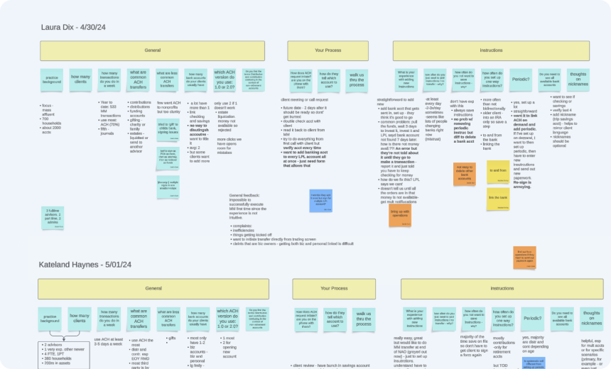
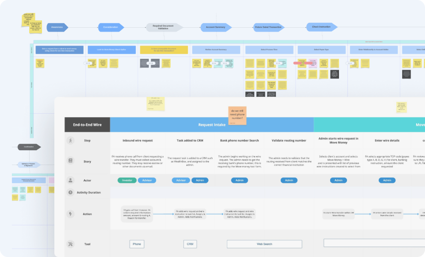
Senior Product Designer, owning end-to-end design strategy and execution for the full Move Money redesign — Check, ACH, and Wire. Brought in specifically for this project in an ambiguous environment with no formal requirements, I built the design foundation through heuristic and system analysis, a full content audit, approximately 500 user feedback reviews, and regular collaboration sessions with SMEs across operations and back-office teams — defining the problem structure before a single screen was designed.
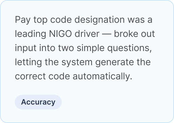
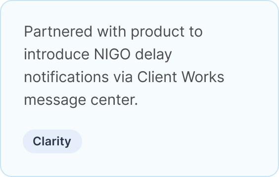
Throughout the project, I presented findings and design recommendations to cross-functional stakeholders, persuading the business to prioritize high-stakes problems — including unlocking saved instructions through a compliance breakthrough and introducing proactive NIGO delay notifications that the business had not yet recognized as a critical advisor need. I later partnered with the research team as the work matured and led QA and production-readiness sign-off — ensuring the rebuilt experience shipped with the precision the legacy system had long lacked.
The legacy Move Money experience had accumulated years of systemic design debt — inconsistent patterns, missing logic, and form structures that actively worked against the advisors relying on them. Rather than enabling transactions with clarity, speed, and accuracy, the experience introduced uncertainty at every step. For advisors managing transfers on behalf of clients, that uncertainty had a cost: frustrated clients, damaged trust, and a platform that had fallen behind the expectations of the professionals depending on it.
The problems weren't surface level. They were structural — embedded in the interaction logic, content architecture, and workflow sequencing of the experience itself.
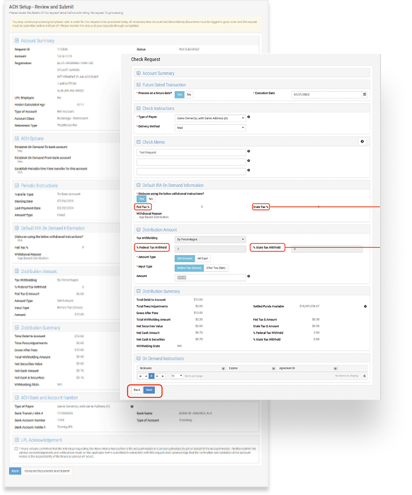
These were among the most critical gaps uncovered through user interviews, advisor feedback, SME collaboration sessions, and heuristic analysis. Each one represented not just a UX failure, but a breakdown in the platform's ability to deliver on its most fundamental promise: moving money reliably.
The best transaction experiences get out of the way. For financial advisors executing transfers on behalf of clients, that means clarity, speed, and accuracy — the ability to complete requests independently, correctly, and with confidence. Every decision in the Move Money redesign was made in service of that standard, executed across three strategic steps.
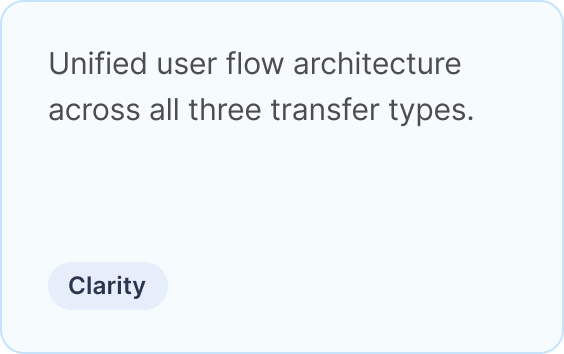
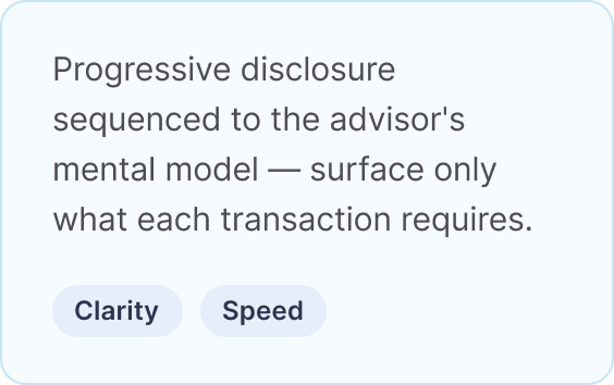
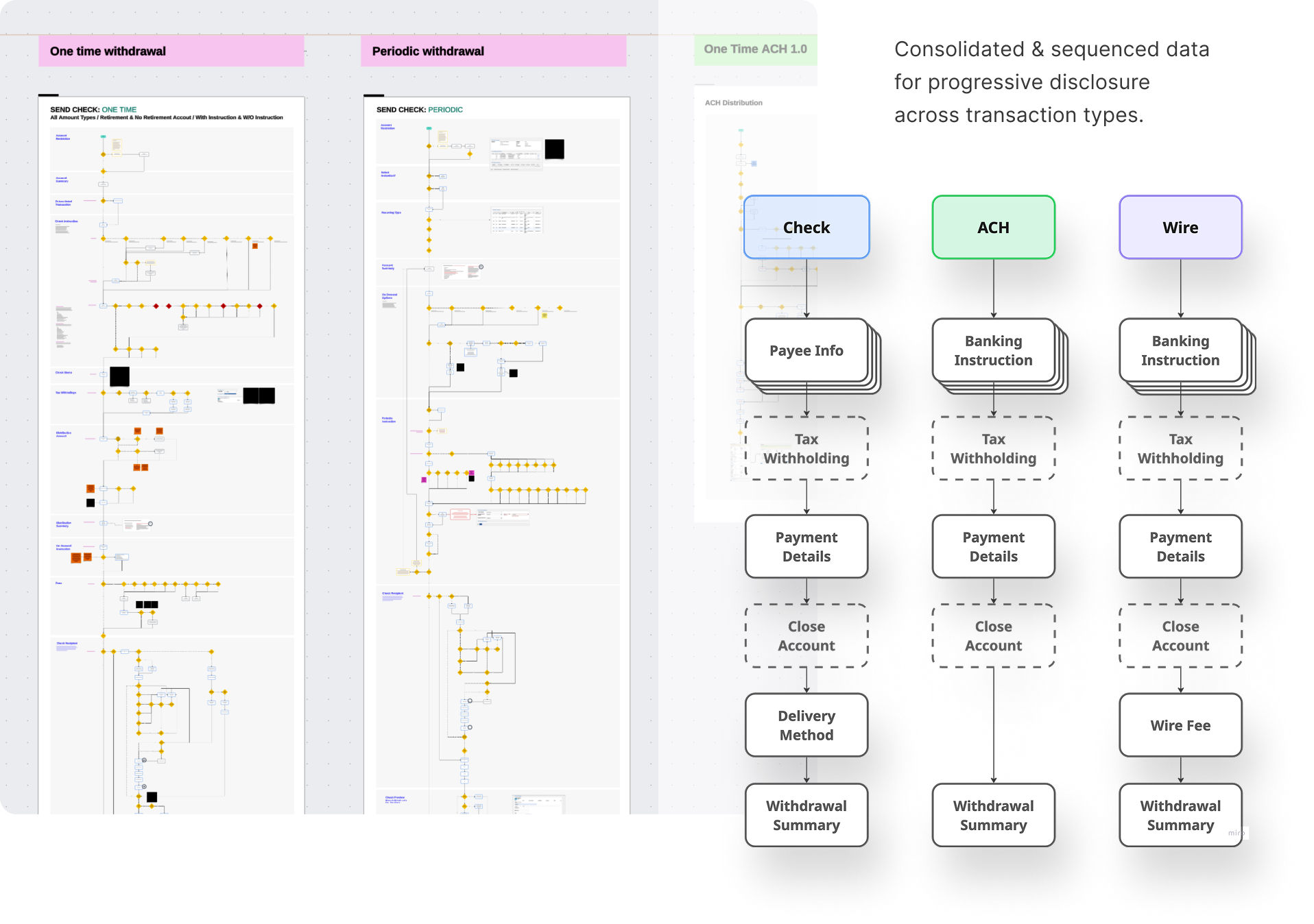
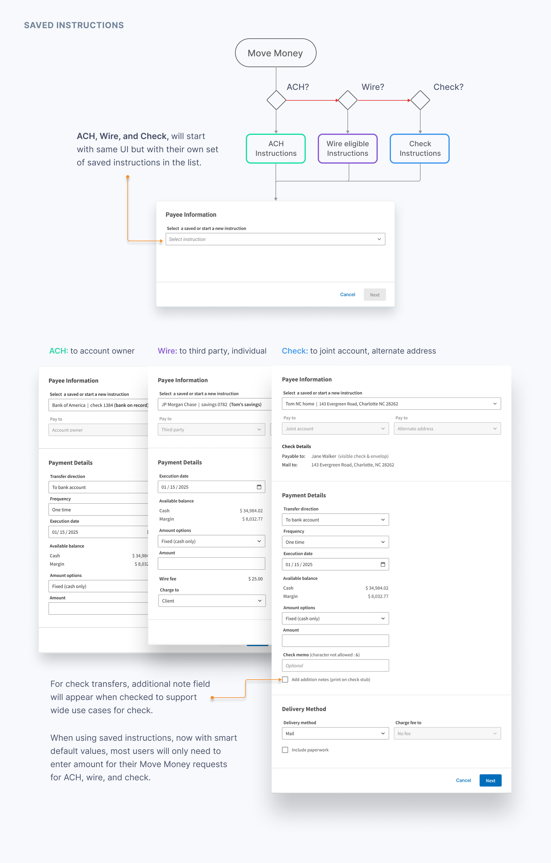
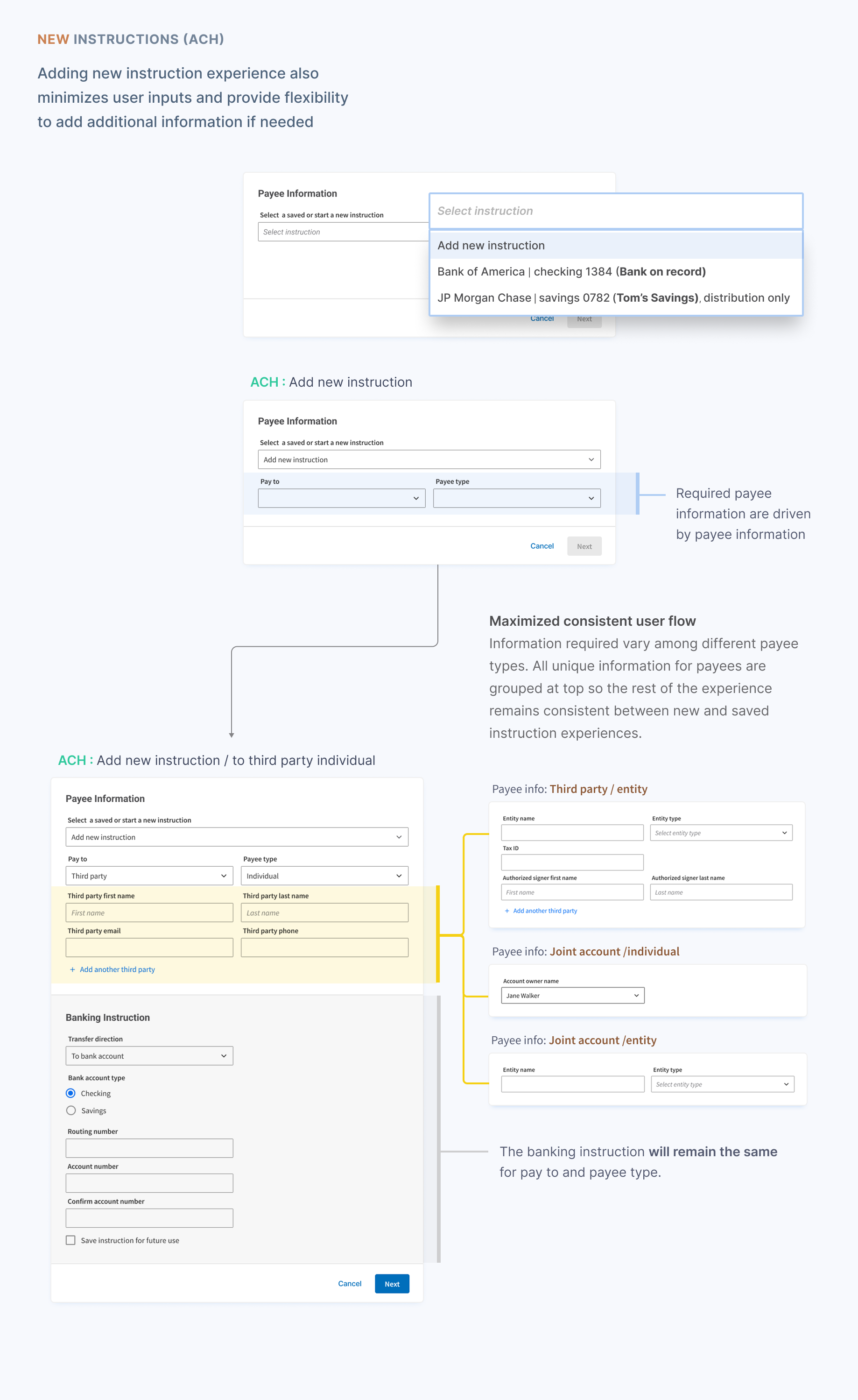
Establish a unified, scalable interaction model across ACH, Wire, and Check that adapts to each transfer type without requiring advisors to relearn the system.
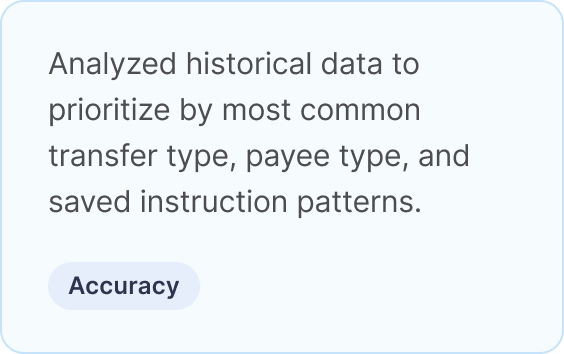
With the foundation established, LPL data guided where to focus first — solving for the highest-impact scenarios, the most common errors, and the biggest friction points before anything else.
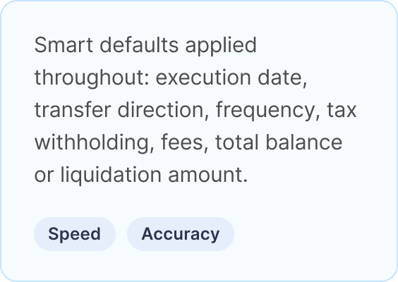
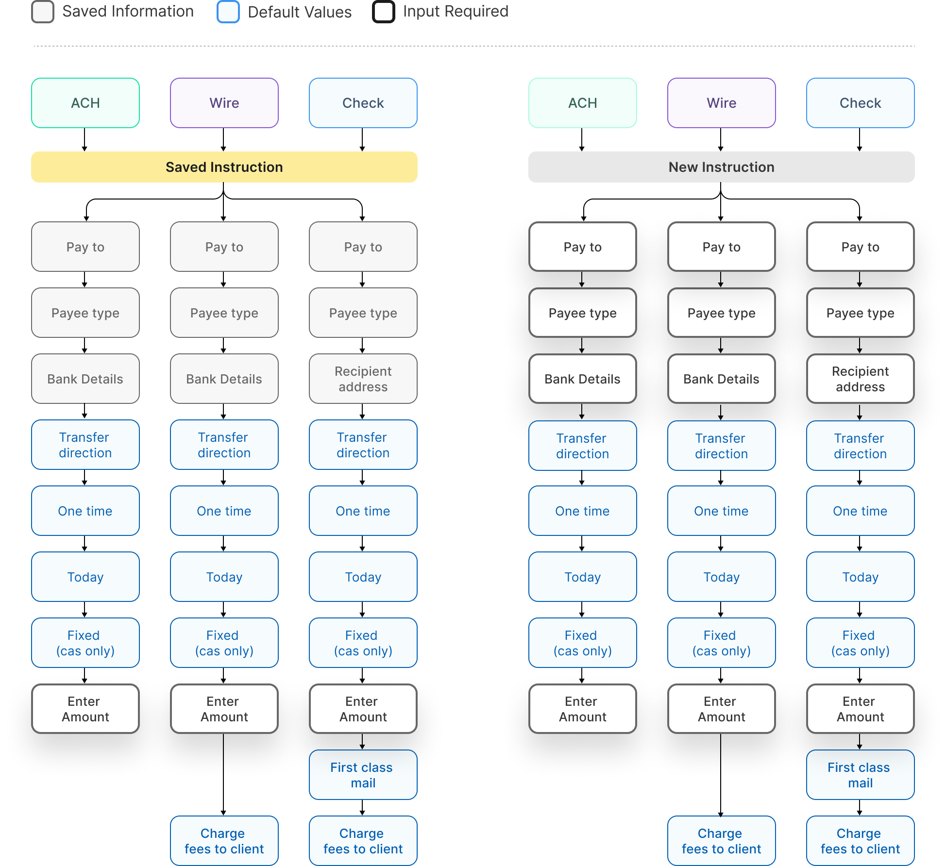
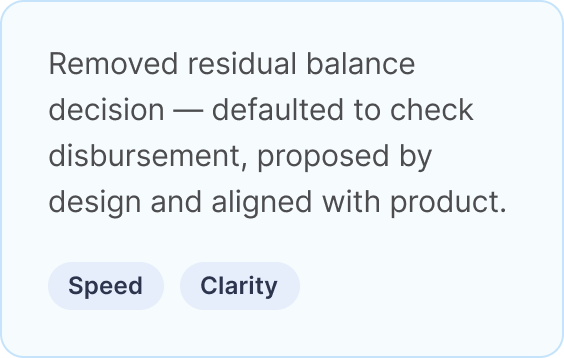
Now users can use instructions to account owners, most transfers (~90%+) will require only an amount to complete the request. With smart default all transfer requests few extra information.
With priorities established, we systematically addressed LPL-specific legacy failures and brought Move Money to modern transaction standards — resolving what was broken, missing, or working against users.
The redesigned Move Money experience is built on one principle: the platform should do the work, not the advisor. Every solution traces back to the failures the legacy experience left unresolved — confusing rules, inconsistent UI, error-prone logic, and a system that placed unnecessary burden on the people who depend on it most.
With the new Move Money experience, advisors no longer need to relearn the system with each transaction. What changes between transfer types is only what needs to be — the inputs specific to each. Everything else is familiar, predictable, and fast.
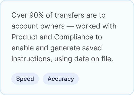
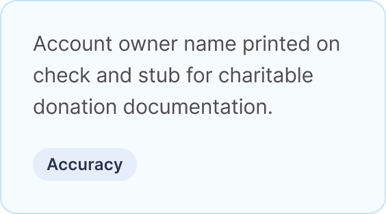
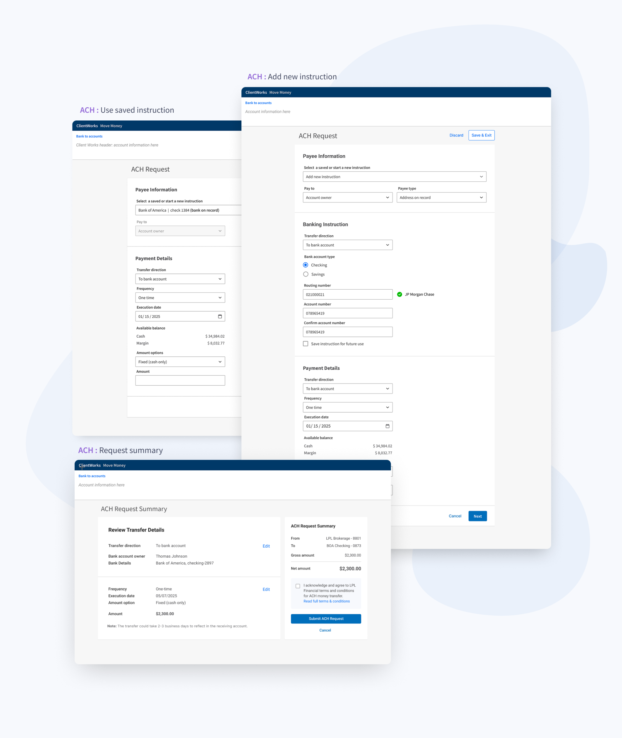
The vast majority of all Move Money transactions are sent to account owners. This is where speed and accuracy matter most, and where the legacy experience created the most unnecessary friction.
The redesigned money will create transfer instructions to the account owner, requiring one input from the advisor: the amount. Everything else is handled by the system — account owner details are pulled from it, and the rest of the required information has a default value that is visible, so advisors can verify at a glance and speed without sacrificing accuracy.
These were the legacy failures with the highest cost — to advisors, to clients, and to LPL's back office. Each one required a targeted solution.
For the majority of transfers, the experience is now exactly what it should have always been: lean, modern, and fast. Initiation presents the instruction path clearly — no assumptions, no backtracking. The transaction screen requires only what the specific transfer needs. Review presents a clean, accurate summary with no surprises. Confirmation is the end of the journey — not the place where problems are discovered.
The legacy experience failed at the basics. The redesign restored them — and built something advisors can trust.
The redesign didn't just modernize an interface — it restored something the legacy experience had quietly eroded: advisor confidence in the platform. Transfers that once required manual follow-up, workarounds, and phone calls to confirm completion could now be executed independently, accurately, and in significantly less time. For advisors managing transfers on behalf of clients, that shift wasn't just operational — it was professional. The platform was finally doing its job so they didn't have to do it for them.
The following results reflect the ACH and Check release. Wire had not yet launched at the time of measurement.
Move Money is a transaction experience — but this project was ultimately a lesson in how to read data, question assumptions, and make design decisions that hold up under the complexity of real human behavior.
The business had already tried to solve the problem once. With ACH accounting for the vast majority of transfers, a standalone ACH solution seemed like the logical answer — address the highest volume, alleviate the most pain. The logic was sound. The outcome wasn't. Advisors refused to learn a new system for a single transfer type while still navigating the legacy experience for everything else. The stat was right. The conclusion it led to was wrong. Data can describe what is happening without explaining why — and why is always where the design lives.
The second attempt took a different approach. Rather than letting a single metric drive the solution, we asked what the data was really telling us. Ninety percent of transfers go to account owners — not just a volume stat, but a mandate. It meant that the fastest, most accurate, most effortless experience we could build wasn't a nice to have. It was the experience that mattered most to the most people, most of the time. We used that insight to push for a compliance breakthrough, unlock saved instructions, and redesign the majority use case around a single input: the amount. Data as direction, not just description.
Then there was the moment staging quietly corrected an assumption we hadn't thought to question. Initial data suggested most users had 10 to 12 saved instructions on average. We designed accordingly. But averages hide distributions — and the real picture was most advisors had 1 to 3 instructions, while a small number had over 50. The design that served the average served almost no one well. We caught it, questioned it, and changed it. The right component wasn't the one that handled the mean. It was the one that handled the reality.
Across every pivot, the lesson was the same: data is the starting point, not the answer. The answer lives in what you do with it — whether you follow it blindly, interrogate it carefully, or recognize when the number in front of you is telling you something true about the wrong thing entirely.
Move Money is the most used transaction in LPL Financial's advisor platform. For the advisors depending on it, every transfer carries a professional promise to their clients — that the money will move correctly, completely, and on time. Designing an experience worthy of that trust, without requirements, without complete data, and with the weight of a failed first attempt behind it, is a reminder that the most consequential design work rarely arrives with everything you need. It asks you to find it yourself — and to know the difference between what the data says and what it means.